I’ve always used PCs. And I have to be honest and say I used to be an Apple basher. I couldn’t see any reason why someone would want an Apple Mac. They were slow, expensive and difficult to upgrade.
Recently however I have to say that I’m growing to like them, a lot. Here’s some reasons why I’m loving the Mac:
They look cool – you have to admit Macs are just so much more sexy than PCs. They are elegant and beautiful.
Simplicity – I admire good design and Apple is a showcase for intelligent, ergonomic design in the hardware and the OS.
They just work – well, err, they just do!
They run Windows – you probably won’t want to run Windows on a mac but you can if you really want.
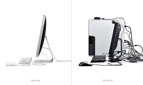
This image which I saw on UsabilityBlog sums it up nicely:
So when it comes to upgrade time will I be swapping my trusty Dell Latitude Laptop for a Mac Pro? Oh yes… And by the looks of Apple’s earnings I’m not the only one.
I was doing some work today on a redesign. Before I started putting pixel to canvas I decided to take a look at the competition to see if designing for 800×600 or 1024×760 was the norm. To my surprise 19 out of the top 20 sites in the sector were fixed width and designed for 800×600!
This surprised me, and got me thinking. I know from spending far too much time in Google Analytics that 800×600 is dying. I regularly see figures below 10% in all niches for 800×600. So why keep designing for 800×600?
I think one reason some big name sites are still opting for 800×600 is that they want to make sure that everyone on the site gets a good experience. It might just be 10%, but 10% is still a sizable enough chunk to matter, especially on high traffic websites. Another big reason for supporting 800×600 is that may people do not browse in maximized windows.
Most computers now ship with monitors supporting a native resolution of 1024×768 (or bigger) and so the number of 800×600 users is going to decrease. With in increasing numbers of widescreen monitors now coming as standard with many PCs the variation in screen resolution is set to continue. So what’s the answer? In my opinion it’s safe to design for 1024×769 of you have a tech-savvy audience. Want mass appeal and to appeal to silver surfers and those on old hardware with CRT monitors? Then my advice is to stick to 800×600.
In my experience when it comes to business and entrepreneurship there are two types of people. Those who take risks and those who do not. Think about it for a minute. Are you a risk taker or do you play it safe? I would class myself as a calculated risk taker. I always balance the risk and the reward. For me the accolade and fruits of success are so appealing that the fear of failure does not cross my mind. And has that benefited me, my clients and my bank balance? Short answer, Yes.
Let’s define risky. I’m not talking about black hat techniques, spamming or anything like that. I’m just talking about not analyzing every little change to your website to the nth degree, going with your gut feeling rather than setting up A/B testing, being daring and generally using you instinct and knowledge to make fast decisions, keep up the momentum and make change happen.
So who wins? The go-getting risk taker or the procrastinator? It has to be the risk taker, they generally just get more done. They force more change, and that change creates opportunity. Think of the successful people and businesses you know. Were they started by risk takers or play-safers? In my circle of acquaintances and clients the risk takers win every time. So next time when your redesigning your website, deciding whether or not to change websites internal link structure or taking time to decide on anything else that could have a negative impact focus on the potential benefits, get it done and move on to the next project. Getting more done brings more reward.